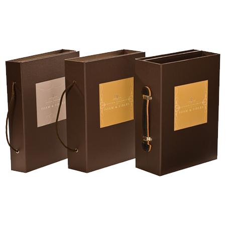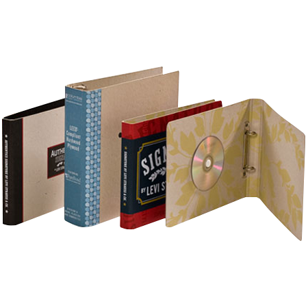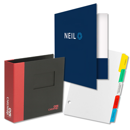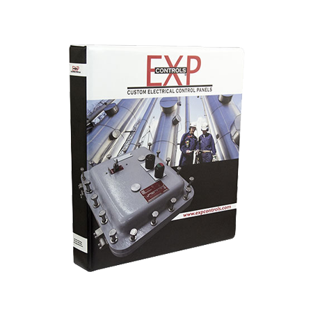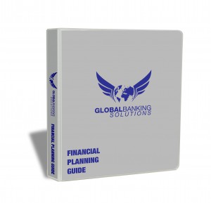
Create a stunning, full color presentation binder by taking advantage of the unlimited design choices, choosing pictures wisely, and considering the surrounding vinyl color that will border the design.
If you want the design to be understated, that is fine; however, full color (four color process) printing opens up many possibilities and you should take advantage of heavy coverage opportunities and the wide open color palette. You can design with the thinnest lines, tightest trap and incorporate multi-color design. You can design with solid colors, photographs and text plus incorporate halftones for shading to create dramatic effect or to fill in cold white space.
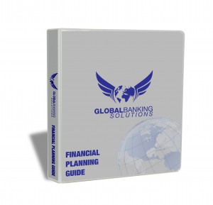
Incorporating photographs can connect the user to your binder. A picture can show them who you are and one or two selective shots can give them an overview of what you have to offer without a lengthy product listing. But keep in mind, the picture doesn’t have to be product advertising. If your corporate office is located in a fantastic building, use a creative shot of the façade to create interest in who your are as a company. Pictures can also be abstract, creating visual interest while your logo and information are incorporated into the shot. The outside cover of your binder is only a preview to what is inside; you’re not trying to tell the whole story on the outside cover. Give them the “thumbnail” that grabs their attention and let them explore from there.

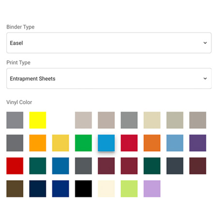
Be intentional about choosing a vinyl color. People incorrectly assume that you have to select white vinyl since you started with a white background for the design; that is not true. The printed paper lays flat on top of the vinyl and if your design has heavy coverage of multiple colors, the last thing you want to do is stick a white vinyl outline around all of that color which only emphasizes that there is a sheet of paper on the panels of the binder. Instead, choosing a vinyl color that compliments your design or a vinyl color that matches the predominant background color you have designed is ideal and creates a smooth transition from your design to the binder itself. The vinyl color choice should assist in creating a cohesive custom presentation and not be a distraction.

Just remember, when designing your presentation binder, don’t think “centered and small” but instead, think “intense, unique and powerful”. Use the unlimited creative platform, incorporate pictures that “Wow” and lastly don’t drop the ball in the final quarter by choosing a vinyl color that doesn’t accent your design. These helpful hints can be applied to full color designs for your clear view presentation binders or your entrapment presentation binders. If you need design help or have questions, contact us and we will be happy to help.


